How to Upload Images to Squarespace (So That They Don’t Break Your Website)
The easiest way to stop people in their tracks is with an astounding photo.
(Personal note: I have a Masters Degree in English, and it guts me to say this. I feel as though I am cheaply endorsing a pretty picture over the laborious art of weaving an elaborate tapestry of words. And yet, it’s true. We are a visual species, and an amazing photograph is how you attract people. You keep the audience with your words, but, yeah, pretty picture first.)
High quality imagery instantly elevates the first impression that your website makes. You do incredible work. You may even have fabulous, professional photography of your products that you are ready to show off. Guarantee that the ‘wow factor’ gets translated onto your website by making sure that the images are prepped and uploaded properly.
The Technical Stuff
The most gorgeous photo can be ruined if it isn’t created and uploaded to your website correctly. Knowing how to do that requires either years of experience, a design degree, or a cheat sheet.
So, here’s your cheat sheet of the things to keep in mind when wrangling images, with all jargon and lingo explained in real-people terms. We also have another blog, Edit Your Photos With Software Already on Your Computer to show you exactly how to do get all of this done.
1) Image Aspect Ratio
Aspect ratio is simply the relationship between the width of an image and its height. Think of an 8x10 photo. The width is 8 and the height is 10. The unit of measure here isn’t important, we are only concerned about the relationship between width and height.
In many places in Squarespace where you might want to show images, you will be give options for choosing the aspect ratio at which you images will be shown. It’s generally a good idea to have the image you upload already saved in the aspect ratio that you plan to show it on the website. It just make it easier to plan.
If you are going to show a group of images together in a grid layout, make sure all the images to be shown in that grid share the same aspect ratio. This keeps the grid nice and clean. If you are choosing to show images in patterns that aren’t as rigid, varying aspect ratios can be fine, and can sometimes create interesting results.
Takeaway from this: Know how you are going to use your image on the website before you upload it.

Simple Grid Sample
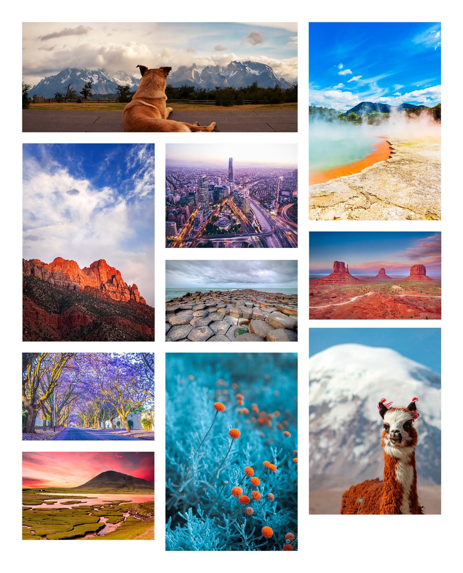
Masonry Grid Sample
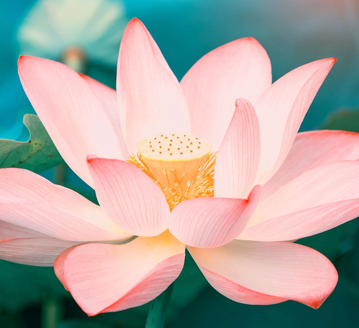
Masthead Image: If you are using a full-width background image in the masthead section of your website (also referred to a hero section or a header section, this is the big, pretty ‘welcome to our website’ billboard space directly under your navigation links and logo), you generally want to use a horizontal image somewhere in the 3x2 to 16x9 range, depending on the height of your masthead.
2) Keep Legibility in Mind
Websites often use images as background decoration for text. Most mastheads contain important text (headlines, offers, announcements) with an image in the background. Be very aware of legibility when choosing the text color, font, and size, and in choosing the image. If a visitor has to work or struggle to read the text on your website, most often they simply won’t.
If the text is going to be black or a dark color, make sure the image that’s behind it is very light to create a nice contrast between the image and the text. Likewise, if using white or very light text, the background image needs to be darker so the text can visually separate from the background and be easily read.
When choosing an image for a background, stick with simple. You don’t want the image to be so detailed and intricate that it distracts from the text the viewer needs to read.
In Squarespace, you can also add a dark or light color theme to a section with a background image. With this setting, you can change the opacity of that color overlay, which will darken or lighten the image.
3) Understanding Which Image Formats to Use
There are three image formats that can be used on a Squarespace website: GIF, PNG, and JPEG.
GIF
GIF stands for Graphic Image Format. It was developed in ancient times (back in the 80s) before the world wide web, when computers were slow, didn’t have a lot of memory, and their screens weren’t that high resolution. At that time, if we wanted a color image, it had to be a tiny, tiny, little file or it would crash your computer or take forever to load. So, we happily sacrificed detail and color range. GIF files are still used in very simple graphics with limited colors, like showing a pie chart. But for the most part, PNGs are a better alternative to the things GIFs used to be good for. Nowadays, GIFs are mostly used to create the animated images that we text to our friends.
For the record, even the Oxford English Dictionary has declared both pronunciations of the word valid ( jif, like the peanut butter or gif, like ‘gift’ without the t). So, we are not wading into that minefield.

PNG
The PNG format was developed in the 90s to be an improved, non-patented version of the GIF format. Officially it stands for Portable Graphics Format.
In today’s world, PNG images are great for simple graphics with somewhat limited color range, such as logos, icons, and images that require a transparent background. So, why can’t we use PNG files for everything on a website? Because PNG files are what’s known as a lossless compression format, meaning that none of the information in your image is tossed out to save space when you save it as a PNG. That is a great feature, except that in images like photographs, it can result in some big, chunky file sizes.
And, big, chunky image files can cause big problems for a website. They can make your site slower, which doesn’t sit well with today’s internet audience, who isn’t going to wait for a website to load. And, large image files can anger the Google gods who will penalize you when it comes to ranking your site in their search results. In order to keep your website as fast as possible and appease the Google gods, we must sacrifice a bit of detail in certain types of images. That’s where JPEGs come into play.
JPEG
Developed a couple of years before PNG, also in the 90s, was the JPEG file format. That stands for “Joint Photographic Experts Group,” because at this point they weren’t even trying to find a cool name.
JPEGs are the most commonly used image format in the world right now, because they are great at compressing large photos down into manageable file sizes. As we said before, the Google gods have declared that large files sizes are bad and websites found guilty of having very large file sizes must be punished. Plus, you don’t want people leaving your website because it’s taking too long to load due to all the massive photo files.
JPEGs are what’s known as lossy because when you compress your image to a JPEG, you lose some information from the file. This means that you always need to keep a backup of the original image. The advantage of this type of compression is that images can be saved into much smaller file sizes before any change in image quality is noticeable to the human eye. Eagles can probably see the difference, but they have better things to do that browsing websites all day. So, JPEGs can give you a photo that looks the same as the original to humans, but with a much smaller file size.
Quick note: JPEG images often have a file extension of .jpg rather than .jpeg because in the old days the Windows operating system could only use three character extensions. Either is fine these days, although .jpg is still more commonly used.
JPEG saved at Best Setting
File Size: 1843 KB

JPEG saved at Medium Setting
File Size: 141 KB

JPEG Saved at Poor Setting
File Size: 70 KB

JPEG Saved at Best Setting
File Size: 60 KB

JPEG Saved at Medium Setting
File Size: 15 KB

JPEG Saved at Poor Setting
File Size: 11 KB
4) Sizing Your Images
When you upload your image, Squarespace will generate up to seven different versions of your image at different sizes for use in different situations. They need this variety of image versions to help make your website responsive (mobile-friendly). When someone views your website on a phone with a small screen, they don’t need to see the same giant version of your image as the person on a massive 32 inch monitor.
So, Squarespace is taking care of a lot of the busy work for you (one of the reasons we love it). You just need to give it a good starting point to work with.
Size the image so that its longest side (doesn’t matter if this is its horizontal or vertical side) falls between 1500 and 2500 pixels. Around 2000 pixels in length is the sweet spot. This keeps the file size from getting too large, and still provides enough information for your photo to look fabulous on a big screen.
5) File Sizes
Once we have sized the image by looking at how many pixels it has in its height and width, we need to look at the size of the file itself. Think about the pixel size of the image as how tall it is. Now, we need to get it on the scale and see how much it weighs. That is the file size.
We don’t measure files in pounds, but in kilobytes (kb or k) and megabytes (mb or m). One megabyte is equal to about 1000 kilobytes.
Best practice is to try and keep each image size below 500kb. It is also advisable to keep your overall page size under 5mb. So, if you have more than 10 images on your web page and they are pushing 500kb each, your page is getting a little chubby and you might want to dial it back a bit. This is more important on your home page than on other web pages. You really want to keep you home page zippy and responsive, since it is usually the first page your visitors will see. Once the user dives down deeper in your site, they may be a little more patient with load times, but don’t abuse that goodwill!
6) Give Your Images Useful File Names
Just like naming a child, the name you give your photo matters (right, Damien?). File names have become much more important recently as Google now indexes and searches the file names on your website as well as the content. Creating descriptive, brief file names will improve your SEO and will also help bring up those images when someone does a Google image search.
Give you images short, descriptive names. We are looking for the ‘just right’ Goldilocks zone here.
Here are four examples:
IMG_2500.jpg isn’t useful to anything but computer software.
Saw.jpg is better, but still doesn’t give you a good idea of what is in the photo. It could be a hand tool, or a gory movie photo. We don’t know.
John-using-table-saw.jpg is a brief summary of the image. Perfect.
John-using-table-saw-after-eating-way-too-much-lunch-after-not-sleeping-last-night-this-could-get-ugly.jpg is a bit more information than we need, although I still want to see that picture.
Notice that in these file names there are hyphens in place of spaces between the words. You could also use underscores (John_using_table_saw.jpg). This is an old-school practice to keep words separate, because spaces have specific meanings in some programming languages. There is less reason to worry about that issue now, but this is still a good habit to get into. There are still some crazy things out there on the internet.
Squarespace recommends that when naming your images, use only letters, numbers, underscores (as in john_saw), and hyphens (as in john-saw). Using any other special character types could prevent Squarespace from uploading and publishing your images.
OK! That is the primer on what you need to keep in mind when uploading your images to Squarespace. If you are now saying to yourself “Great. So, how do I do any of that?” don’t worry. We’ve got you covered in our blog Edit Your Photos With Software Already on Your Computer.